Cluster Analysis of Milwaukee K12 Schools
Introduction
Let’s say you’re doing an analysis of K12 schools, and you want to group schools based on the student populations they serve. One way to accomplish this task is to use the k-means clustering algorithm to group schools into a perdefined (i.e. k) number of groups or clusters.
k-means clustering will group the schools in k groups so that each school is in the group for which it is closes to the group average.
Cluster Analysis
Importing the Data
For this post, I will be using data made publicly available through the Wisconsin School Report Cards. I have pre-processed this data in into an R package called wisconsink12, and it can be downloaded from GitHub with the following code:
# Use devtools to install from GitHub

devtools::install_github("cityforwardcollective/wisconsink12")
More information on accessing data in this package can be found on the package’s GitHub repo – here I will only provide instructions pertaining to the analysis at hand.
Once the package is loaded, we have access to several tables and functions to process those tables into commonly-needed formats. The code below will prepare a dataframe suitable for our purposes.
set.seed(1234) # Set seed to ensure reproducibility

library(tidyverse)  # I'll use this package for data processing
library(wisconsink12)

# Create the dataframe with a wisconsink12 function

mke_rc <- make_mke_rc()

# Process dataframe for student demographic data

demo_rc <- mke_rc %>%
  select(school_year,
         dpi_true_id,  # School unique identifier
         starts_with("per"),  # Select student demographic variables
         -c(per_choice, per_open)) %>% # Drop % Choice and % Open Enrollment
  filter(school_year == "2018-19" & !is.na(per_ed))
We now have a dataframe demo_rc that contains variables for the school year, a unique identifier for the school, and the race/ethnicity, economic status, disability status, and English proficiency status of the student body. All of the student-descriptive variables are represented as proportions of the whole, the same as a percentage divided by 100. We will be grouping the schools based on these variables.
Preparing the Data
Now that we have our data loaded, we can turn towards the actual process of implementing the k-means algorithm. Our first step is to ensure that our data is scaled appropriately.
Simply stated, the k-means algorithm will calculate the distance of an observation’s variable from a cluster center. In terms of this analysis, an observation would be a school, and a variable would be any of those student body characteristics, such as percent of economically disadvantaged students. All of these variables are ratios of one, but if the variance and spread of the variables is not the same, then a variable with the most variance will have more influence than a variable with little variance. To mitigate this effect, we will first scale the data.
# scale() will scale our data

scaled_demo <- scale(demo_rc[3:12])
Now that the data is scaled, we can perform the first step in clustering, which is calculating a distance object that will be used by the clustering algorithm.
# dist() wills calculate dist object

dist_demo <- dist(scaled_demo)
With our dist object now calculated, we are prepared to run the algorithm. Implementation of the algorithm itself is fairly straightforward – basically, you need to identify x (for us that is the dist object), and the number of centers. This can be coded as kmeans(dist_demo, 3).
What we’ve omitted so far is any analysis to aid us in choosing k, the number of clusters. As it turns out, this will be our most difficult task.
Determining k
Two popular methods for determining the number of clusters to choose (when unkown, as in our case) are the Elbow Method and the Average Silhouette Method.
Elbow Method
The elbow method is based on the total within-cluster sum of squares (WSS). Total WSS is a measure of variance within each cluster – put another way, it’s a measure of the distance between the actual observations in each cluster and the cluster center. The higher the total WSS, the less close to center, or less alike, observations within a cluster are with each other. Therefore, we are looking to minimize the total WSS, meaning observations are as close to group averages as possible.
The kmeans() function will actually provide the total WSS as an output, so we can employ some functional programming to evaluate k values between one and ten.
# Elbow Analysis
# Map over k values 1:10

tot_withinss <- map_dbl(1:10, function(k) {
  model <- kmeans(x = dist_demo, centers = k)
  model$tot.withinss
})

# Create df with WSS values for each iteration

elbow_df <- data.frame(
  k = 1:10,
  tot_withinss = tot_withinss
)

# Plot WSS values for each value of k

elbow_df %>%
  ggplot(aes(k, tot_withinss)) +
  geom_line() +
  scale_x_continuous(breaks = 2:10) +
  labs(title = "Elbow Method: Total Within-Cluster Sum of Square")
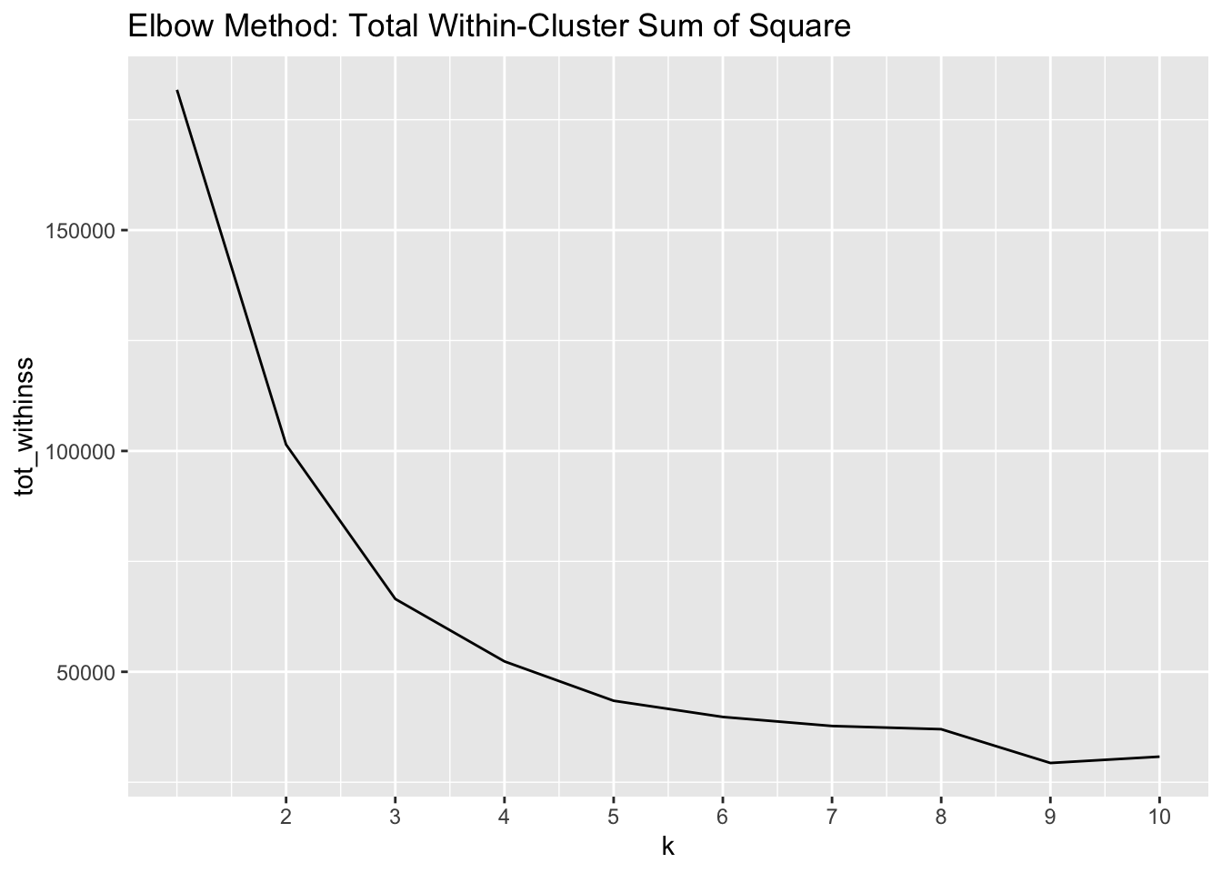
The elbow we are looking for is located at 3 clusters – this elbow tells us that adding another cluster does not decrease the total WSS much more.
Average Silhouette Method
The second method we will use to evaluate the number of clusters is the average silhouette method. Whereas the total WSS evaluates intra-cluster validity, the average sihouette will tell us how well each observation fits its assigned cluster than its next closest cluster.
Much the same way we calculated the total WSS above with the elbow method, the code below will calculate and visualize the average silhouette.
# Silhouette Analysis
library(cluster)

sil_width <- map_dbl(2:10, function(k){
  model <- pam(x = dist_demo, k = k)
  model$silinfo$avg.width
})
sil_df <- data.frame(
  k = 2:10,
  sil_width = sil_width
)

sil_df %>%
  ggplot(aes(k, sil_width)) +
  geom_line() +
  scale_x_continuous(breaks = 2:10) +
  labs(title = "Average Silhouette Method")
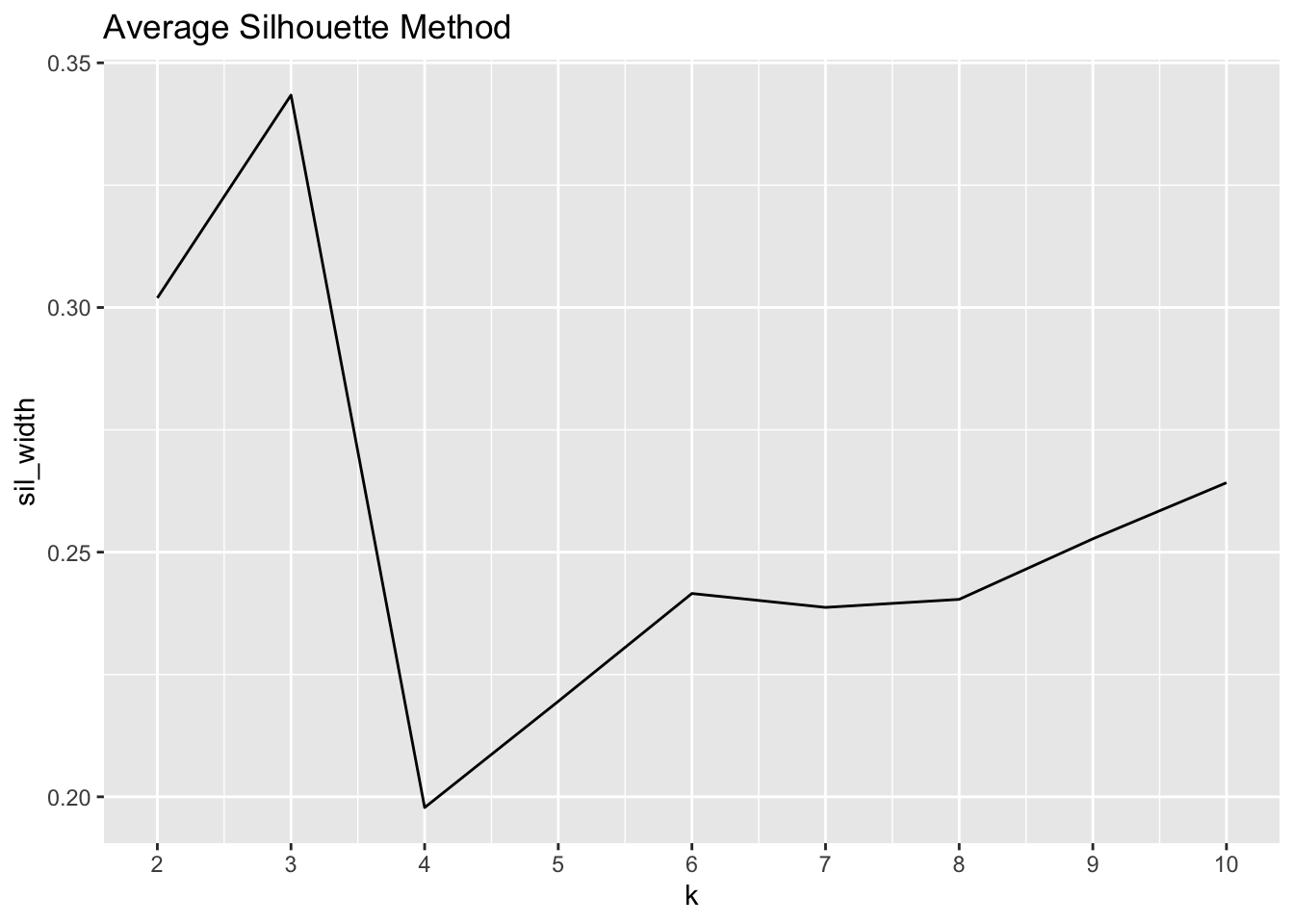
Whereas with the elbow method we were trying to minimize the total WSS, here we are aiming to maximize the silhouette width. As the visual above portrays, the maximum value is found at k = 4, but k = 3 is a close second.
Since the elbow method drew us to k = 3 and the silhouette method showed us that k = 3 is very close to the maximum silhouette value, we will choose to set the number of clusters at 3.
Clustering the Schools
Now that we have determined k, we can go ahead and actually group the schools into clusters. As we saw above, the code to implement the k-means algorithm is actually quite simple, as shown below.
# Final Clustering with 3 Clusters

k_clust <- kmeans(dist_demo, centers = 3)
We have created k_clust, which is a kmeans class object. If we examine the structure of this object, we see that it is actually a list, the first element of which is an integer vector designating the cluster of the observation and indexed the same as our original dataframe. This means we can join it with our dataframe so we can evaluate which schools fall within which cluster.
The code below will add a cluster variable to our dataframe of schools, and then it will summarise the student body demographic variables and the Report Card score variables.
# Create variable `cluster` to designate the cluster
# Don't forget to filter for the correct school year
# to match that data we clustered

ach_clustered <- mke_rc %>%
  filter(school_year == "2018-19" & !is.na(per_ed)) %>%
  mutate(cluster = as_factor(k_clust$cluster))

# Calculate the number of schools in each cluster

n_demo <- ach_clustered %>%
  group_by(cluster) %>%
  summarise(N = n())

# Calculate summary statistics for each cluster

c_demo <- ach_clustered %>%
  group_by(cluster) %>%
  summarise_at(vars(per_am_in:per_lep, overall_score, sch_ach, sch_growth), .funs = mean, na.rm = TRUE) %>%
  modify_at(vars(per_am_in:per_lep), scales::percent, .1) %>%
  modify_at(vars(overall_score:sch_growth), round, 1)
With the data joined and cleaned, we can now inspect the results by creating a table with our summary information.
library(kableExtra) # Used for tables

c_demo %>%
  left_join(., n_demo, by = "cluster") %>%
  select("Cluster" = cluster,
         N,
         "Asian" = per_asian,
         "Black" = per_b_aa,
         "Hisp/Lat" = per_hisp_lat,
         "White" = per_white,
         "ECD" = per_ed,
         "SwD" = per_swd,
         "LEP" = per_lep,
         "Overall" = overall_score,
         "Achievement" = sch_ach,
         "Growth" = sch_growth) %>%
  kable(booktabs = T) %>%
  kable_styling() %>%
  add_header_above(c(" " = 2, "Percent of Students" = 7, "School Report Card Scores" = 3))
| Cluster | N | Asian | Black | Hisp/Lat | White | ECD | SwD | LEP | Overall | Achievement | Growth |
|---|---|---|---|---|---|---|---|---|---|---|---|
| 1 | 144 | 2.0% | 85.8% | 6.1% | 3.0% | 88.5% | 15.2% | 1.2% | 63.2 | 25.1 | 65.2 |
| 2 | 22 | 10.3% | 29.3% | 25.5% | 28.9% | 62.5% | 11.9% | 8.0% | 73.9 | 51.2 | 73.7 |
| 3 | 106 | 5.5% | 21.7% | 55.2% | 13.8% | 74.3% | 11.9% | 19.3% | 71.5 | 43.2 | 71.1 |
Results
Cluster 2 is the largest cluster, and it has the highest percentage of black students, economically disadvantaged students, and students with disabilities.
Cluster 3 is the second largest, and it has the highest percentage of Hispanic or latinx and limited English proficiency students, and the second highest percentage of economically disadvantaged students.
Cluster 1 is the smallest cluster by a large margin, it has the highest percentage of white students, and the lowest percentage of students with disabilities.
Put another way, Cluster 2 could be considered as those schools serving the most disadvantaged populations, Cluster 3 the second most, and Cluster 1 the least. The Report Card Scores follow this interpretation as well, with the most disadvanted clusters showing the lowest average scores.
Spencer Schien
Senior Manager of Data & Analytics
This is my bio. There are many like it, but this one is mine.