Cool Word Clouds in R
Make word clouds denser and in custom shapes
Introduction
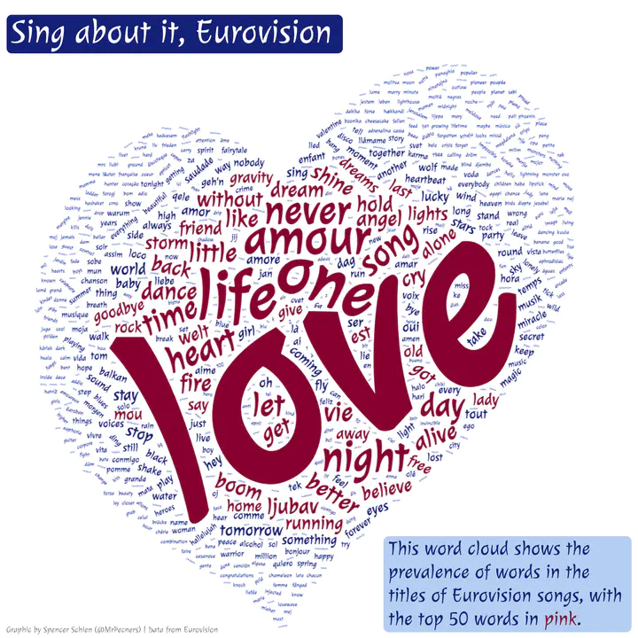
This post explains how I created the word cloud above, which was my submission to week 20 (2022) of the TidyTuesday project. There are plenty of how-to articles out there about creating word clouds in R (e.g. here), so what I want to highlight here is what I learned myself that I didn’t find explained in the other posts.
In particular, I want to highlight the following:
- How word clouds are created in R, and how we can create one in a custom shape
- How to manipulate raw SVG in R
- How to manipulate the word cloud with ggplot once we make it
Resources
If you’d like to work along with this post yourself, here is where you can download the data and the packages we’ll be using. I’ll explain the packages as we go, but I’m providing them to you here for your convenience.
# Get data from the TidyTuesday repo

eurovision <- readr::read_csv('https://raw.githubusercontent.com/rfordatascience/tidytuesday/master/data/2022/2022-05-17/eurovision.csv')

# Packages we'll need

library(tidyverse)
library(svgparser)
library(grid)
library(wordcloud2)
library(tidytext)
library(stopwords)
library(showtext)
library(MetBrewer)
library(glue)
library(ggtext)
library(cowplot)
Making the word cloud
Prepping the data
We’ve already loaded the data to the eurovision object above. Our next step is to transform the data to the proper format for the word cloud. This format provides a vector of unique words that appear in the corpus along with their frequency. We’re creating a word cloud of song titles of Eurovision-performed songs, so the song titles are our corpus. We’ll also want to exclude what are known as stopwords, which are words such as pronouns and conjunctions that are common but are more structural than meaningful for text analysis.
The tidytext and stopwords packages makes this process easy. Since this is Eurovision, there are many lanugages included. Therefore, we might as well load the stopwords for all languages included in the stopwords package. Then, we’ll do an anti_join() to remove those words from our corpus. Finally,
we’re left with a dataframe that contains a column with the words and another column with their frequency.
# We're invoking the {tidytext} and {stopwords} packages here
# You'll need to install/load them if you haven't already

# Get countries for stop words
all_countries <- stopwords_getlanguages(source = "snowball")

# Get stop words for all languages available
stops <- map_df(all_countries, function(x) get_stopwords(language = x))

# Get words from titles, remove stop words
t <- eurovision %>%
  transmute(line = 1:nrow(eurovision),
            text = song) %>%
  unnest_tokens(word, text) %>%
  anti_join(stops) %>%
  # this final step removes a leading apostrophe in words like l'amour
  mutate(word = str_remove(word, "^\\w'"))

# Get frequencies by grouping by word and tallying
tidy <- t %>%
  group_by(word) %>%
  summarise(freq = n()) %>%
  arrange(desc(freq))
Choosing the word cloud library
First things first, how can we make a basic word cloud in R? The wordcloud package in R is an easy way to make a basic word cloud, as shown below.
library(wordcloud)

wordcloud(tidy$word, tidy$freq)
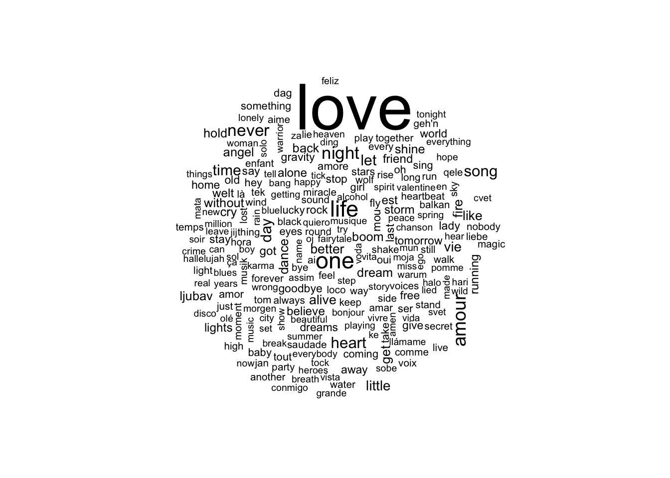
This word cloud isn’t quite what I’m looking for, though. Mainly, I’d like to make it in the shape of the Eurovision heart, and this isn’t possible with the wordcloud package. Also, the word packing algorithm doesn’t result in the density I’d like.
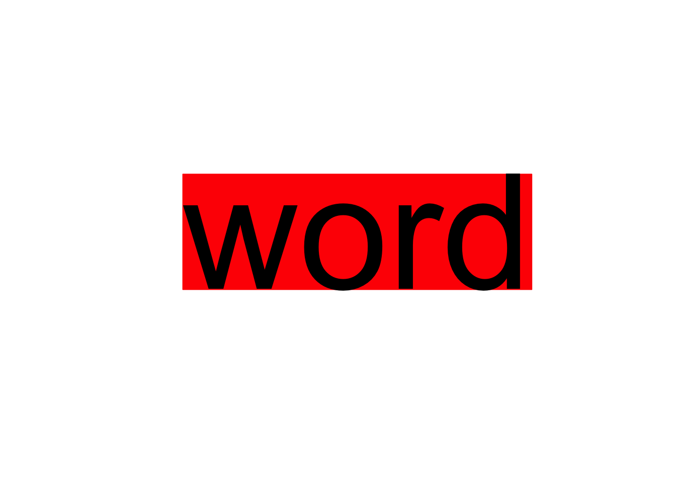
The wordcloud package uses base R plotting capabilities (as opposed to grid, which is what underlies ggplot2). For each word, it calculates the width and the height of the word to create a bounding box of space occupied by the word. The algorithm then places words based on this definition of occupied space.
For instance, I’ve plotted “word” below, along with its bounding box in red. By the method described above, no other word will overlap with the red box. This creates a limit on the density of the resulting word cloud.
word <- "word"
plot.new()
str_w <- strwidth(word, cex = 10)
str_h <- strheight(word, cex = 10)

rect(xleft = .5 - str_w/2, xright = .5 + str_w/2,
     ybottom = .5 - str_h/2, ytop = .5 + str_h/2,
     col = "red", border = "red")
text(x = .5, y = .5, label = word, cex = 10)
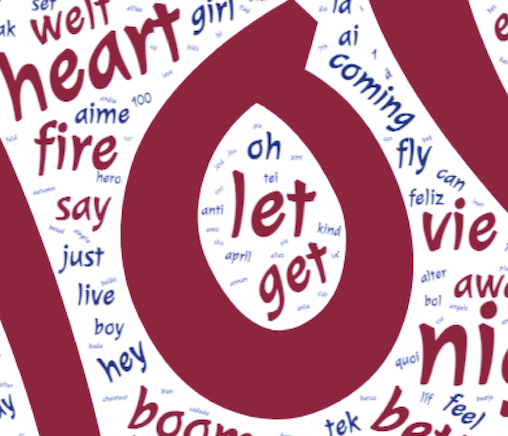
The wordcloud2 package does not use this methodology. Instead, it uses a method that defines which pixels are occupied by a word, as opposed to the bounding box occupied by the whole word. This allows for a word to be placed in between letters, or even inside the loop created by a letter, such as the ‘o’ shown below. The result is a much denser word cloud.
Further, wordcloud2 allows for custom masking of the cloud (i.e. using custom shapes), which is what we want to do with the Eurovision heart. The tricky part is that wordcloud2 is built on the wordcloud2.js JavaScript library, and the product is built in HTML via the htmlwidgets R package. So, the plot ends up in a webpage instead of an R graphical device. This means we can’t export the plot as we usually would with ggsave() or png(), let alone adding it to our ggplot workflow.
I’ll address these issues a bit later. Now that we have decided on wordcloud2, we need to prep for the mask by finding an image of the Eurovision heart we can use.
Getting the mask
The wordcloud2 package creates masks based on black and white images, where the black defines the shape of the cloud. So, if we can find an image of the Eurovision heart in black, we’re set!
With non-vector images (i.e. PNG or JPG), though, I worry about resolution and scalability. My preference is usually to work with SVG objects, which also allow for easy manipulation, too. A quick Google search for an SVG of the Eurovision heart led me here, where I found this SVG:

As I mentioned above, wordcloud2 will use a black and white image to create a mask for the word cloud, where the black will be the area for the words to be placed. This heart isn’t filled, so the words would only be placed in the outline of the heart if we used this as-is. We’ll need to fill it to meet our purposes.
We can view this SVG by inspecting the page. This SVG is comprised of two paths, the inner heart and the outer heart – the area between the two is what gets shaded black. I figured this out by inspecting the <path> element of the <svg> element. I saw the paths are defined as page coordinates, and each path starts with m and ends with z. (For more about SVG paths, see here.)
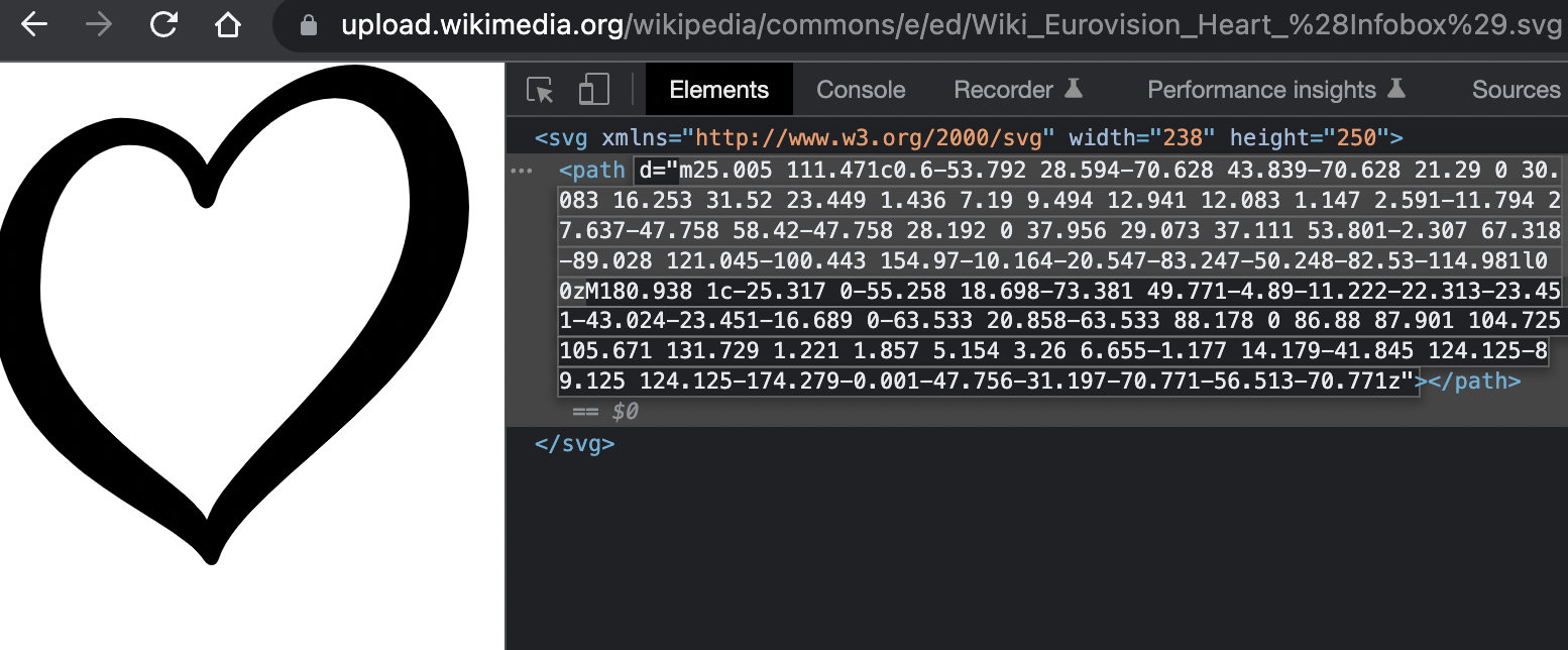
Even without knowing the ins and outs of SVG’s, we’ve gotten this far by knowing how to inspect a webpage. Further, knowing that this SVG is built out of a path, we can manipulate the SVG by manipulating this path. Specifically, we can create a filled heart by deleting one of the paths. We’ve already observed that the two paths are denoted by a leading m and a trailing z, so we can toy with deleting one or the other to see what we get.
We can import our desired SVG element by copying the code for the SVG element (i.e. everything from the opening <svg> to the closing </svg>) from the page. We can read the SVG into R using svgparser::read_svg(), and then we can plot it. This code below does just that, and it saves the resulting plot as a PNG file.
# The {svgparser} package allows us to read in the raw SVG element.
library(svgparser)

# I've already edited the path here to only include the outer heart outline.

heart <- "<svg xmlns='http://www.w3.org/2000/svg' width='238' height='250'><path d='M180.938 1c-25.317 0-55.258 18.698-73.381 49.771-4.89-11.222-22.313-23.451-43.024-23.451-16.689 0-63.533 20.858-63.533 88.178 0 86.88 87.901 104.725 105.671 131.729 1.221 1.857 5.154 3.26 6.655-1.177 14.179-41.845 124.125-89.125 124.125-174.279-0.001-47.756-31.197-70.771-56.513-70.771z'/></svg>"

png(filename = "logo.png", width = 7, height = 7, units = "in", res = 500, bg = "white")
grid.draw(read_svg(heart))
dev.off()
## quartz_off_screen
##                 2
This fully-shaded-in Eurovision heart will become our mask for wordcloud2, so we’re ready to move on to actually creating our word cloud!
Plotting
The plotting of our word cloud is easy enough with the wordcloud2 package – we just call the wordcloud2() function, set our arguments as we like, and there we have it!
Depending on your purpose, you’ll want to play around with the arguments to get the desired end product. (You can learn about the arguments by reviewing the documentation yourself with ?wordcloud2.)
# The {wordcloud2} package provides an HTML5 interface to word clouds

library(wordcloud2)

# The {MetBrewer} package provides some great palettes

library(MetBrewer)

# Set colors, I wanted pink and blue since I already saw 'love' is tops

colors <- met.brewer("Benedictus")
c_trim <- c(rep(colors[1], 50), rep(colors[length(colors)], nrow(tidy) - 50))

# Create wordcloud with settings for this blog post. See below for actual
# settings I used to create the plot in the featured image.

wordcloud2(tidy, figPath = "logo.png",
           widgetsize = c(700,700), ellipticity = .9, gridSize = 10,
           color = c_trim, backgroundColor = "white")
(If you don’t see anything above, try reloading the page.)
The word placement on the page is random (assuming you haven’t set shuffle = TRUE). This means every time you load the page, it is trying new iterations of word placement, resulting in word clouds that look slightly different, or it might even fail to load word cloud because it failed to fit all the words. Assuming you’re happy with the function settings, you can keep reloading the page until you get an arrangement you like.
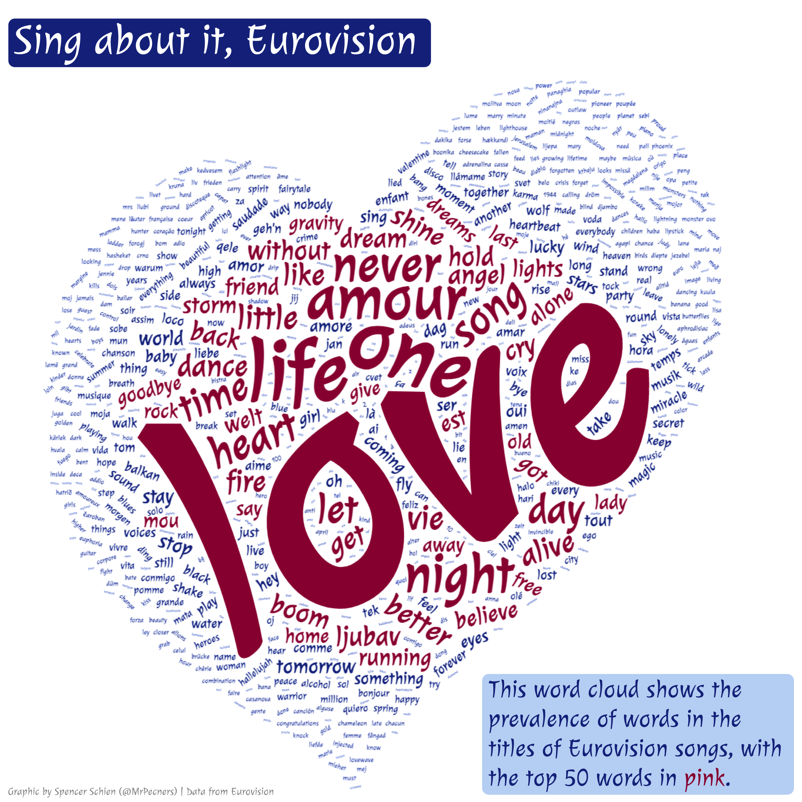
Below is the actual function call I used to create the word cloud in this post’s featured image. I reloaded the image until ‘love’ was cocked at an angle like in the final version.
wc <- wordcloud2(tidy, figPath = "logo.png", size = 3,
           widgetsize = c(1200,1200), ellipticity = .9, gridSize = 10,
           fontFamily = "Julee", color = c_trim, backgroundColor = "white")
Julee font. I tried to use the showtext R package to load this Google font, but it wasn’t working with wordcloud2. So, I ended up downloading the font family and manually adding it to my computer’s fonts.
Bringing it back to ggplot
Now we’ve created our wordcloud – great! But it’s in an HTML format instead of our familiar ggplot format. The solution I’ve found to get our word cloud back to ggplot is as follows:
- Once you have your word cloud looking exactly how you’d like, save it as an image.
- I have tried to find an R code solution to this, but I could only find functions that save the HTML, not an image. Please let me know if you have a code solution!
- Read the image back into R and plot it as a raster.
- Add it to a blank plot, and from there you can use
ggplotto add annotations, titles, captions, etc.
Saving the image is straightforward, at least using point-and-click techniques. I advise opening the word cloud in your browser because I had trouble saving it from the RStudio Viewer. You can open it in the browser by clicking the Show in a new window button on the RStudio Viewer pane.
With the word cloud open in your browser, you might have to reload the page again to get back to to the orientation you like. Once there, right click on the word cloud and select Save image as…, and save the image to your working directory. (I’m saving it as heart.png.)
Now that we have the image, we can draw it in a ggplot context using cowplot::draw_image(), as shown below.
# The {cowplot} package is a useful ggplot extension. We're using it
# here to draw the image on a plot.

library(cowplot)

# Initialize a blank plot, and then add our word cloud

img <- "heart.png"

qplot(0:10, 0:10, geom="blank") +
  draw_image("heart.png", x = 0, y = 0, width = 10, height = 10)
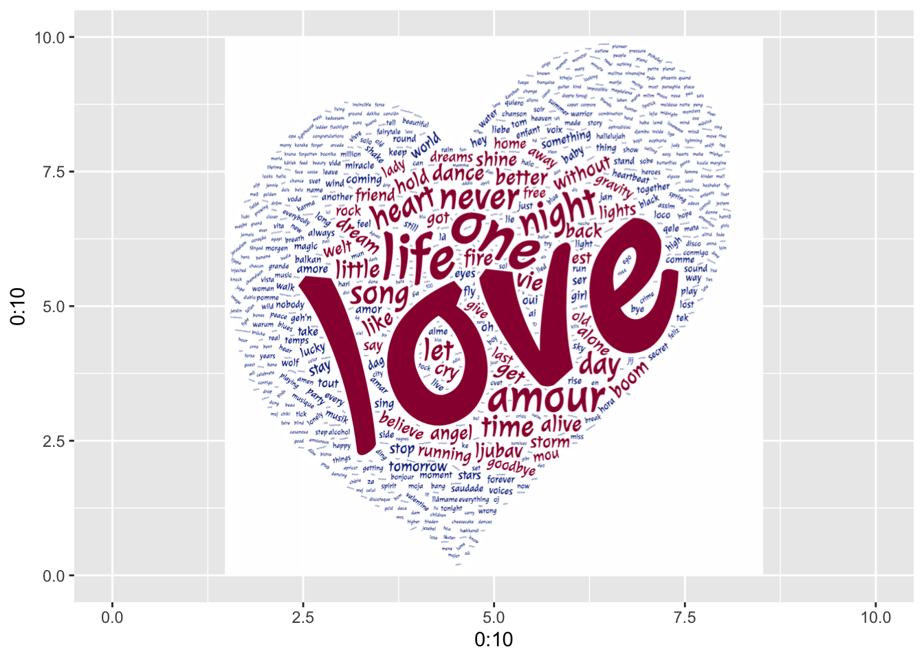
Fantastic! The reason I want to get the word cloud back to a ggplot context is because I can easily manipulate the plot, add titles and annotations, combine it with other plots, etc.
To produce the final version similar to this post’s featured image, I used the following code. If you print this plot in RStudio, things will look like they overlap – that’s because the positioning is based on the final image size I’m going for, which is 9in. x 9in.
# The {showtext} package makes importing fonts a breeze.

library(showtext)

# Here's how you can use {showtext} to add a font for use with {ggplot2}

font_add_google("Julee", "julee")
showtext_auto()

# Full plot with title, annotation, and caption

final_plot <- qplot(0:10, 0:10, geom="blank") +
  draw_image(img, x = 0, y = 0, width = 10, height = 10) +
  # geom_textbox comes from the {ggtext} package
  geom_textbox(data = tibble(1), minwidth = unit(4.75, "in"),
               x = .1, y = 10.75, hjust = 0, vjust = 1, fill = colors[10],
           size = unit(12, "pt"), lineheight = .7, color = "white",
           label = "Sing about it, Eurovision", family = "julee",
           box.padding = margin(5,0,2,5)) +
  geom_textbox(data = tibble(1), color = c_trim[51], fill = c_trim[length(c_trim)],
                x = 9.9, y = .1, hjust = 1, vjust = 0, box.size = 0,
               label = glue("This word cloud shows the prevalence ",
                            "of words in the titles of Eurovision songs, ",
                            "with the top 50 words in ",
                            "<span style='color:{c_trim[1]}'>**pink**</span>."),
                family = "julee", size = 7, minwidth = unit(3.5, "in"),
               box.padding = margin(5,0,2,5)) +
  scale_y_continuous(limits = c(0, 11), expand = c(0,0)) +
  scale_x_continuous(limits = c(0, NA), expand = c(0,0)) +
  theme_void() +
  annotate(geom = "text", x = .1, y = .1, hjust = 0, vjust = 0,
           family = "julee", color = "grey60", size = 3,
           label = glue("Graphic by Spencer Schien (@MrPecners) | ",
                        "Data from Eurovision"))

# Save your plot as a large image (i.e. 9in x 9in)

ggsave(final_plot, filename = "final_plot.png", bg = "white",
       w = 9, h = 9)
Conclusion
So there you have it! We now know how to create word clouds in custom shapes with tight word packing, and we can bring it back to a ggplot context. The SVG piece of this is especially powerful, I think, because once you start manipulating SVG’s, the sky’s the limit on what you can create – we can have word clouds in whatever shape we want!
To close this post, I’d like to acknowledge limitations to this methodology. I would love to hear from anyone who has answers to these points:
- I wish there was an R-native package that built this word cloud instead of using a JavaScript library. Building our plot in an HTML widget only to then export it as a static image is definitely the long way around.
- Even going the HTML widget route, I wish I had a better handle on why the word cloud fails to load so often.
- I wish I knew how to export a snapshot of the HTML widget with R code.
I hope you’ve enjoyed this post!
Spencer Schien
Senior Manager of Data & Analytics
This is my bio. There are many like it, but this one is mine.