Creating High-Quality 3D Visuals with Rayshader
Introduction
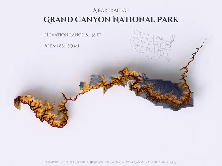
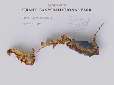
This post walks through how to create graphics like the one above using rayshader. There is an accompanying GitHub repository with all the necessary code located here.
Tyler Morgan-Wall – the author of rayshader – has written pretty extensive reference material (see the rayshader website), but I still struggled quite a bit when I left the confines of the pre-written examples. Therefore, I thought it would be helpful to myself and others trying to get started with rayshader if I jotted down this tutorial with some of my lessons-learned.
Clarifying the basics
When I first started trying to work with rayshader, I spent a lot of time reviewing the package documentation, and I struggled because there were certain concepts that were taken as given but were definitely new to me. Here’s a quick overview that I think will be helpful.
Data requirements
At a basic level, rayshader takes a matrix of elevation data and plots it. If you’re more accustomed to dataframes than matrices, working with a matrix might not be intuitive at first.
Consider the matrix below. This is a 5x5 matrix, i.e. 5 rows by 5 columns, and each cell has a value. In our rayshader context, each cell would represent the x-y location of a point, and the value of the cell would be the elevation, also known as the z axis.
matrix(c(1:5, 5:1), nrow = 5, ncol = 5)
You probably won’t find data in raw matrix form in the wild, though – more likely you’ll find elevation or similar data in raster form. Rasters are similar to the matrix format above, where there are x and y coordinates that make up a grid (or matrix), and the value of cells represents the z axis.
If this still isn’t clear, think of an image made up of pixels. Pixels are arranged in a grid with rows and columns, and the pixel color is determined by the value of the respective cell. The image below illustrates this concept.
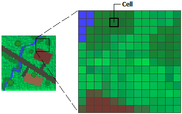
Okay, so to recap, we need data to be in matrix form for rayshader, but we’re more likely to find elevation data and the like in raster form – luckily, it’s easy to convert raster to matrix (as we’ll see below). Therefore, when hunting for data to make a graphic with rayshader, we should look for raster data. If you’re downloading files, look for TIF or GeoTiff files. If you’re downloading via API, you might just need to specify raster, though it’s probably the default format.
Where to find data
There are tons of resources out there to download elevation or water body depth. Here are a few resources I’ve gone to:
- Bathymetry of the Great Lakes (Download the GeoTiff file)
- Bathybase: bathymetry of numerous US lakes
- General Bathymetric Chart of the Oceans
- AWS Terrain Tiles
Local governments often provide this data as well, so if there is a particular park or lake, it’s worth looking on their
websites. For our purposes here, we’ll be using the AWS Terrain Tiles to access elevation data. Lucky for us, the elevatr R package developed by Jeffrey W. Hollister makes downloading this data a breeze.
Rendering the base graphic
(NOTE ADDED 2023-01-03)
I’ve received feedback that following the code in this post frequently leads to an error. To avoid this error, download the latest dev version of rayshader and rayrender.
remotes::install_github("tylermorganwall/rayshader")
remotes::install_github("tylermorganwall/rayrender")
Our first step will be to render the data in 3D, and then we will create a high-quality graphic from there.
Loading the data
To use elevatr to load our data, we first need to define the boundaries of what we want. For our example here, we’re using Grand Canyon National Park (GCNP) boundaries. The USGS has a useful mapping tool that allows you to interactively find the park you want. Using this tool, I was able to locate tract files for GCNP here. To follow along with our example code, place the unpacked folder in your data subdirectory.
By default, elevatr will return tiles corresponding to the location you query, but if we specify boundaries, it will clip the returned data to those specifications. The code below will accomplish this for us.
# The `sf` package is used to read our boundary shapefile.
# The `elevatr` package is used to get elevation data.
library(sf)
library(elevatr)

# Read in park boundaries
data <- st_read("data/grca_tracts/GRCA_boundary.shp")

# Query for elevation data, masked by our 'location' specified as the
# `data` object, defined above.
gcnp_elev <- get_elev_raster(data, z = 10, clip = "location")
You can find out more about get_elev_raster() with ?get_elev_raster, but I want to highlight two points here:
- We have specified here
z = 10, which sets the zoom level (i.e. resolution) of the data returned. Ranging from 1 to 14, higher numbers represent higher resolution, which means more data points, which means longer to plot/render. When I’m just beginning to work on a graphic, I’ll start withz = 10, but once I’m ready to produce a final product, I’ll pushzas high as my machine can handle (usuallyz = 12). - We are setting
clip = "location"because that is how we get data defined by our specified boundaries. If we were instead to passget_elev_raster()a point, the returned data would be the tile in which that point was located.
The last thing we need to do before we start rendering is to conver the data to matrix format. The data returned by elevatr is in raster format, but lucky for us, rayshader has a convenient raster_to_matrix() function that does exactly what it says.
# Convert our raster data in
mat <- raster_to_matrix(gcnp_elev)
Scene rendering
With our data in matrix format, we’re really cooking with gas and ready to render! As I said above, the rayshader website has great tutorials to get you started with different options for rendering. I’m going to gloss over a lot of that to just give us what we need here for our purposes.
We will be using rayshader’s plot_3d() function, which will require two objects from us:
- The
heightmap, which should be a two-dimensional matrix where each cell represents elevation for that point. - The
hillshade, which should be the “hillshade/image to be added to 3D surface map.”
The heightmap is straightforward enough – that’s our mat object we’ve already created. But the description of the hillshade is a bit more confusing. We need to provide an image? How does that work? This part took me a while to wrap my mind around, so I’m going to devote some space to explain it here.
First of all, following the examples on the rayshader website, we can see that height_shade() is creating the necessary hillshade object. For instance, the following code would succeed in plotting our data:
# Plot data with `plot_3d()`
mat  |>
  height_shade() |>
  plot_3d(heightmap = mat)

# Close the window when you're done
rgl::rgl.close()
If we want to take control and customize our graphics, we need to understand how this is working, though. So, after reviewing the help for height_shade() with ?height_shade, we see there are two important arguments in play. First the heightmap, which we already know is our mat object. Second, we have the texture argument.
Texture was foreign to me at first, but as the help page states, it’s really just a color palette for the plot. The tricky thing here is that it takes a function to return a color palette. (You could just pass it a list of colors, but that probably won’t be what you’re looking for.)
The default assignment is texture = (grDevices::colorRampPalette(c("#6AA85B", "#D9CC9A", "#FFFFFF")))(256). This too might look a bit weird because of the trailing (256) – what’s happening here is that colorRampPalette() is returning a function, but instead of assigning that function to a separate variable, we’re passing it anonymously here and specifying its only argument as 256. (You might have encountered this in ggplot’s accompanying scales package, e.g. scales::label_comma()(var).)
This creates a palette that is interpolated between three specified color values, and the length out of the palette is 256 (i.e. there will be 256 points along this color palette scale, ranging from one one end to the other). For instance, below are the specified colors.
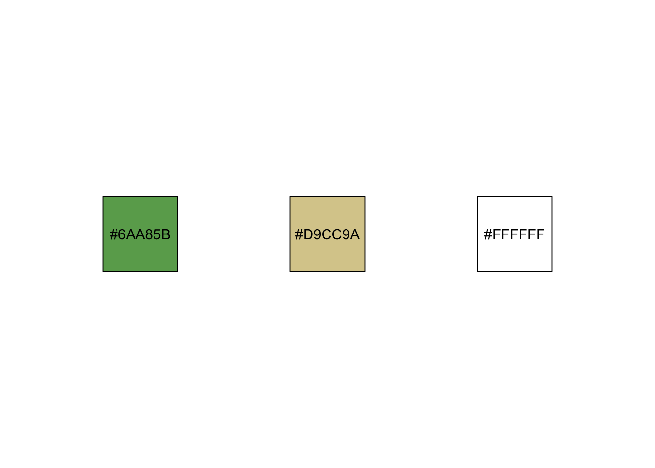
This is starting to make more sense – we still might not understand how this function is creating an image, but we can see how individual color values are passed to create a palette. Knowing this, we can now start to customize.
height_shade() function actually does create a temporary PNG file, which it then reads back in as an array. It is the array that is ultimately returned by height_shade(), and which is passed to plot_3d() as the hillshade.
Customizing colors
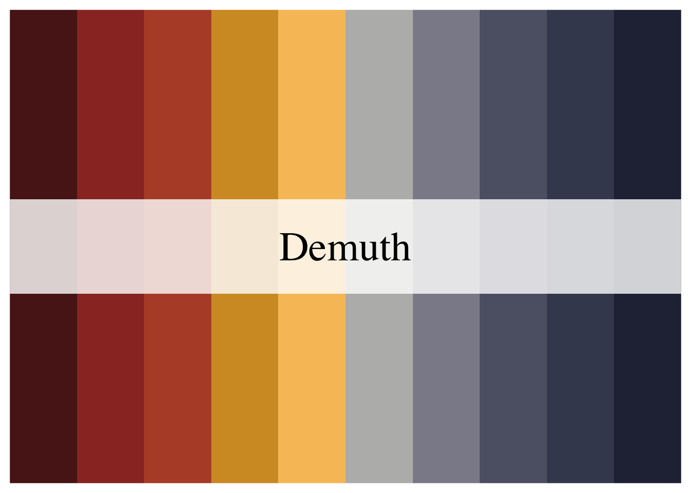
Back to rendering – we already saw a very basic way to render our data using default settings, but let’s start customizing. First, let’s specify the color palette we want. There are two R packages I like to use for color palettes: MetBrewer has a number of great palettes (though not all of them are colorblind-friendly), and scico provides scientific color palettes that are perceptually uniform and colorblind-friendly.
For our example graphic of the Grand Canyon, I chose to use MetBrewer’s Demuth palette, which is colorblind-friendly.
library(MetBrewer)
# Specify the palette name in its own variable so that
# we can reference it easily later.
pal <- "Demuth"
colors <- met.brewer(pal)
We don’t need to get too crazy here, all we have to do is replace the default colors with our colors.
# We're finally using the `rayshader` package here, so you'll need to load it
library(rayshader)

mat |>
  height_shade(texture = grDevices::colorRampPalette(colors)(256)) |>
  plot_3d(heightmap = mat)
That should have opened an interactive window with an object that looks like this:
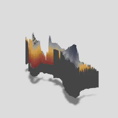
We can notice a few things right away. We successfully implemented our color palette, our data is rendered in 3D (though something looks off), there is scene lighting that casts a shadow, and we’re viewing the object from an angle. We’ll want to update our settings in several ways to produce the graphic we want.
The code below will fix several issues:
# Dynaimcally set window height and width based on object size
w <- nrow(mat)
h <- ncol(mat)

# Scale the dimensions so we can use them as multipliers
wr <- w / max(c(w,h))
hr <- h / max(c(w,h))

# Limit ratio so that the shorter side is at least .75 of longer side
if (min(c(wr, hr)) < .75) {
  if (wr < .75) {
    wr <- .75
  } else {
    hr <- .75
  }
}


# Make sure to close previous windows

rgl::rgl.close()

mat |>
  height_shade(texture = grDevices::colorRampPalette(colors)(256)) |>
  plot_3d(heightmap = mat,
          windowsize = c(800*wr,800*hr),
          solid = FALSE,
          zscale = 10,
          phi = 90,
          zoom = .5,
          theta = 0)
- First, I want to set the window height dynamically based on the size of the object we’re rendering. We can do this by setting width and height proportional to the number of rows and columns of the matrix. This method sets the longer side to 800 with the same aspect ratio as the data.
- Within the
plot_3d()call, we’ve setsolid = FALSE. This removes that grey base from our image. We’re going to be viewing from directly above, so we wouldn’t see it for the most part, but there is still out outline that comes through. zscale = 10decreases the height scale (default iszscale = 1). Increasing this number will decrease the height exaggeration, and vice versa. This is tied to the resolution of your data, so if you keepzscaleconstant but increase resolution by upping the zoom in yourget_elevation_raster()call, you’ll see a similar change in the rendered scene.- The
phiargument is the azimuth angle, or the angle at which you are viewing the scene. 90 degrees is setting it directly above the scene, 0 degrees would be a horizontal view. zoomis exactly what it sounds like. Resolution of the data affects this, so you might need to adjust the zoom based on your resolution.thetais the rotation of the scene. Imagine your scene on a lazy susan and spinning it – that’s what this setting is doing. Setting it totheta = 0means no ration, i.e. the original orientation of your data, with north being up in most cases.
shadowdepth. When you set it manually, keep in mind that you’ll be setting the background floor to that elevation relative to your data. This means if your data spans -200 to 10,000 and you set shadowdepth = -100, your shadow will actually be in the middle of your scene!
If you’ve reviewed the rayshader website, you saw a lot of additional shading done to the scene (e.g. by chaining add_shadow() between height_shade() and plot_3d()). This shading isn’t necessary when you’re planning to use render_highquality(), and chaining those additional shadow functions can really slow things down. We’ve already added everything we need to start using render_highquality().
Render High Quality
The render_highquality() function will take the current scene and raytrace it (this is why you needn’t add shadows earlier). Without going through the documentation line by line, there are just a couple points I want to make about using this function.
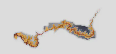
- Not high quality – When reviewing the vignettes, the graphics produced by
render_highquality()didn’t strike me as particularly high-quality. For instance, taking the scene we’ve already built and rendering it with default settings with the coderender_highquality("your_file.png"), we’ll get the image below. What I was missing was that you can userender_highquality()to increase the size of the graphic, which scales the quality of the image.
-
Using good lighting – I spent A LOT of time messing with the light settings within
render_highquality()trying to create more nuanced shading, but in the end the affect I was after was best achieved by using environmental lighting (more on that below). -
Yes, it takes a while – When you’re first getting started, you might worry that your session is hung or some problem has occurred, but it’s probably just taking your computer a while to do all the raytracing of the scene. This is a computationally expensive process, so you’ll need to be patient.
-
Get your file name right – When you call
render_highquality()and specify your file to save the image to, there is no validation of your file path until it tries to write to the file. This means you could go through the whole process of rendering the scene (which can take a long time), just to have it fail to save in the end because your file name was bad. (I’ve opened an issue about this.)
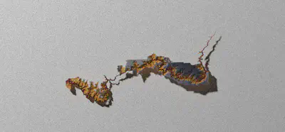
Alright, let’s get to it. First, as I pointed out above, we’ll be using environmental lighting. You can use environmental lighting by adding an HDR file. You can find these types of files on Poly Haven, and I’m using this one. Once you have that downloaded, we’re ready to build our call.
render_highquality(
  "gcnp_highres.png",
  parallel = TRUE,
  samples = 300,
  light = FALSE,
  interactive = FALSE,
  environment_light = "env/phalzer_forest_01_4k.hdr",
  intensity_env = 1.5,
  rotate_env = 180,
  width = round(6000 * wr),
  height = round(6000 * hr)
)
This took quite a bit of trial and error for me to settle on all these arguments. Let’s review line by line:
- First, we have our file name. I just want to point out again that an error in your file name will cause this whole process to fail. We’re not doing anything complex here, but if you’re saving to a subdirectory and get the path wrong, or if you’re using
glue()but don’t have thegluepackage loaded, it will fail (both of these have bitten me). - Next, I’m specifying
parallel = TRUE. This tellsrender_highquality()to use parallel processing, which speeds things up. - The
samplesargument is passed on torayrender::render_scene(). I’m honestly not entirely sure what impact this has, but I set it to 300 because the default sample method is optimized for asamplesset higher than 256. (See?rayrender::render_scenefor more information.) - I set
light = FALSEbecause we’ll be using environmental lighting. - I set
interactive = FALSEbecause I don’t want to accidentally screw up the scene while it’s rendering by accidentally interacting with it (yes, I accidentally did this before) - The
environment_lightis where you specify your HDR file intensity_envadjusts how intense the lighting is. The lighting in our environment isn’t terribly bright, so I’ve bumped it up from the default of 1 to 1.5- The
environment_lightwill be coming from a certain direction, and you may want to adjust it. Our Grand Canyon has a predominant east-west direction, so I’d like it to be coming more perpendicular to that. By default, our light comes from the NNE, so we can specifyrotate_envto spin that around (as on a lazy susan), with positive values moving it that many degrees in the clockwise direction. Settingrotate_env = 180will have the light coming from the opposite direction, in our case from the SSW. - Finally, we set the width and height of our image using the aspect ratio method described above to math that of our object. This is where we increase the resolution by increasing the number of points plotted.

There we have it! This is our base image – from here, we’ll be adding annotations.
Annotating the graphic
Now that we have our base graphic, the final touches will be to add annotations. Caution: Make sure from here on you don’t overwrite the original file on accident because you don’t want to have to re-render the graphic.
The render_highquality() function has the ability to add text to the image, but I’ve found that I prefer to add it by other methods because 1) it gives more flexibility and 2) you don’t want to have to re-render every time you tweak your annotations. Instead, I use the magick R package, which is an R wrapper for ImageMagick.
The first thing we need to do is to read in our image that we’re going to annotate.
# Load magick library, which provides R interface with ImageMagick
library(magick)

# Read in image, save to `img` object
img <- image_read("plots/gcnp_highres.png")

# Set text color
text_color <- colors[1]
Next, we’re going to add our title annotations. It took me a while to get the hang of this, but when you’re using ImageMagick to annotate, you can set gravity to the cardinal directions (i.e. north, east, northeast, etc.), and the annotation will be aligned to that spot. This means if you choose gravity = north, your text will be centered at the top of the image, whereas gravity = east will right-align and right-justify your text.
I’m also using the Cinzel Decorative font, which I’ve downloaded and added to my font library. When I’m using ggplot, I use the showtext package to do this, but I had trouble referencing the font with magick, so I just added it to my computer. If you don’t want to bother with that, just delete all the font arguments in the image_annotate() calls below.
# Title
img_ <- image_annotate(img, "A Portrait of", font = "Cinzel Decorative",
                       color = colors[1], size = 125, gravity = "north",
                       location = "+0+200")
# Subtitle
img_ <- image_annotate(img_, "Grand Canyon National Park", weight = 700,
                       font = "Cinzel Decorative", location = "+0+400",
                       color = text_color, size = 200, gravity = "north")
data object. The elevation range is computed from the max and min values of our heightmap matrix. Keep in mind the units of everything.
# Square miles, converted from square meters
area <- as.numeric(st_area(data)) / 2.59e6

# Elevation range, converted to feet from meters
elev_range <- (max(mat, na.rm = TRUE) - min(mat, na.rm = TRUE)) * 3.281

# Area
img_ <- image_annotate(img_, glue("Area: {label_comma()(round(area))} sq mi"),
                       font = "Cinzel Decorative", location = "+1200-1000",
                       color = text_color, size = 110, gravity = "west")

# Elevation range
img_ <- image_annotate(img_, glue("Elevation Range: {label_comma()(round(elev_range))} ft"),
                       font = "Cinzel Decorative", location = "+1200-1300",
                       color = text_color, size = 110, gravity = "west")
Notice that we are justifying the elevation range and area annotations to the left by setting gravity = west.

Next up, let’s add the inset map to indicate the location within the United States. This inset is created by first plotting the map using ggplot, then we use ImageMagick to add it to our original image.
states <- spData::us_states

spot <- st_buffer(st_centroid(data), 100000)
text_color <- colors[length(colors)]


loc_plot <- ggplot() +
  geom_sf(data = states, fill = "transparent", color = text_color, size = 0.2) +
  geom_sf(data = spot, fill = NA, color = colors[2]) +
  theme_void() +
  coord_sf(crs = 3347)

loc_plot
ggsave(loc_plot, filename = glue("plots/gcnp_inset.png"), w = 4*1.5, h = 3*1.5)

# Read plot back in so we can manipulate it
inset <- image_read(glue("plots/gcnp_inset.png"))

# Scale plot
new_inset <- image_scale(inset, "x1000")

# Add plot to annotated graphic
img_ <- image_composite(img_, new_inset, gravity = "east",
                        offset = "+1200-1000")
Finally, all that’s left is to add our caption. The tricky part here was to add the Twitter logo in combination with our Cinzel font. FontAwesome would allow us to add the Twitter icon, but we’d have to us FontAwesome for our text too. My solution was to create an image of the Twitter icon and add it manually – probably not the best solution, but hey, it works.
Below, we’re adding our caption copy, then we’re adding the Twitter icon.
# Caption
img_ <- image_annotate(img_, glue("Graphic by Spencer Schien (     @MrPecners) | ",
                                  "Data from AWS Terrain Tiles and USGS"),
                       font = "Cinzel Decorative", location = "+0+50",
                       color = alpha(text_color, .5), size = 75, gravity = "south")

# Twitter
twitter <- fa("twitter", fill = text_color, fill_opacity = .5)
grid.newpage()

tmp <- tempfile()
png(tmp, bg = "transparent")
grid.draw(read_svg(twitter))
dev.off()

tw <- image_read(tmp)
tw <- image_scale(tw, "x75")

img_ <- image_composite(img_, tw, gravity = "south",
                              offset = "-530+65")


image_write(img_mosaic, glue("plots/gcnp_fully_annotated.png"))
Conclusion
There you have it! We’ve found data, converted it to the needed format, plotted it in 3D, rendered a high-quality image, and then annotated it to create a stunning final product. We can repurpose our code to use any elevation or bathymetry data as well.
I’m sure some of my methods aren’t the most efficient, and I’d love to hear from you if you have better methods – regardless, happy mapping!
Spencer Schien
Senior Manager of Data & Analytics
This is my bio. There are many like it, but this one is mine.